Phenom
Bringing transparency to interview scheduling
Two features that gave recruiters visibility into what they were sending and why availability changed, before and after the invite.
John SmithNDA Protected — Product Manager
Laura SmithNDA Protected — UX Designer
Adrian Burlău — Product Designer
John SmithNDA Protected — Product Manager
Laura SmithNDA Protected — UX Designer
Adrian Burlău — Product Designer
Disclaimer: This project is under NDA, the screens are recreations for portfolio purposes not the shipped product, but reflective of the actual design solutions I developed.
Scheduling sits at the center of hiring and recruiters were flying blind at both ends of it
At a large HR tech platform serving global enterprises, the scheduling product connects recruiters, interviewers, and candidates across a system handling thousands of interviews daily.
Product design ownership across problem definition, exploration, prototyping, usability testing, and refinement. Worked closely with PM, UX, engineering, and QA, using recruiter behavior and test evidence to guide product decisions. This case study covers two features that directly improved recruiter visibility and confidence during the scheduling process.
Two recurring blind spots, same root cause
Recruiters were dealing with two moments where the system had information they needed and no way to see it.
No idea what the candidate is about to see
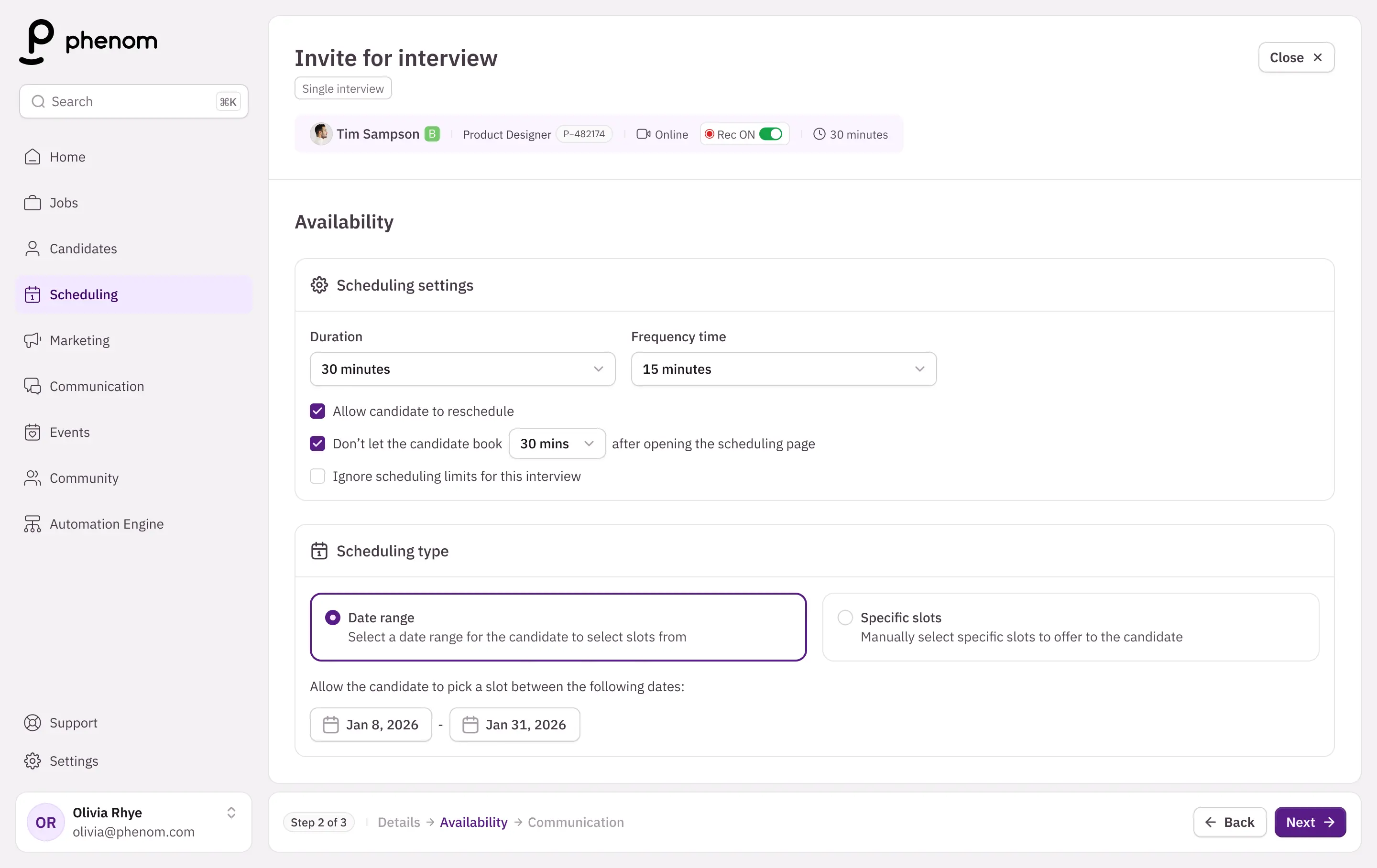
When creating a scheduling invite, recruiters choose between a date range (slots generated automatically) or specific slots (picked manually).
Either way, they had no feedback on what they were actually sending before the candidate received it.
No way to verify what went wrong
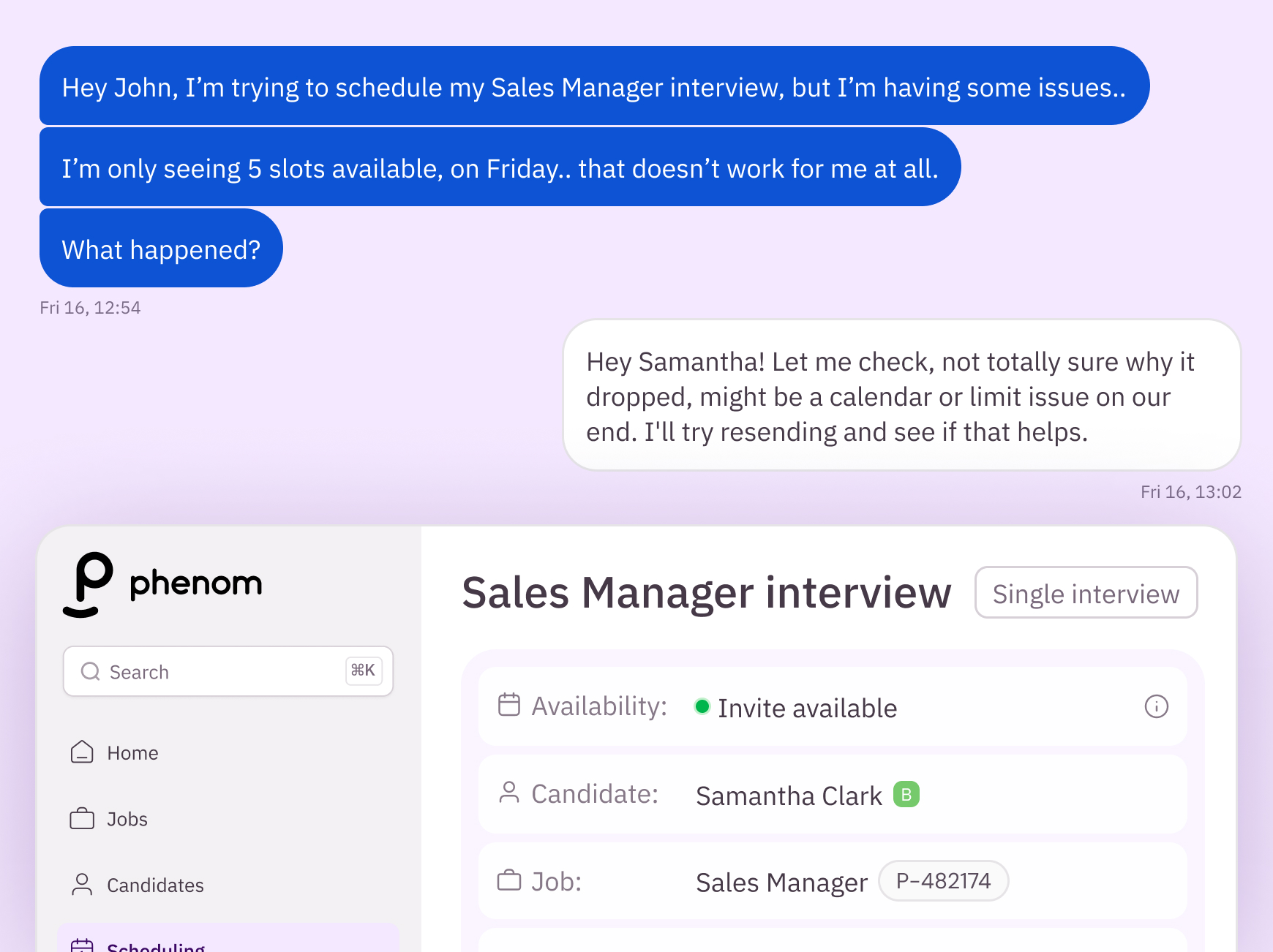
When a candidate came back saying the slots didn't work for them, or worse, that there were none left at all, recruiters couldn't verify it or understand why.
Slots disappear for real reasons, like calendar changes, interview limits, other bookings, but none of that was visible.
Availability isn't a number, it's a confidence signal
A raw slot count doesn't mean the same thing for every role. Five open slots is excellent coverage for a senior, niche position and critically low for a high-volume one. If we surfaced a flat number, we'd be misleading recruiters in both directions.
The opportunity wasn't to expose more data, it was to translate that data into a signal recruiters could trust at a glance, in the moment they needed it.
That signal needed to exist twice: once before the invite goes out, and once after. Using the same scale and language both times, so understanding it in one place means understanding it everywhere.
Two features, one signal
The transparency banner brings the signal forward while configuring an invite. Debug tool lets recruiters investigate that signal further: before or after sending the invite, for full audit.
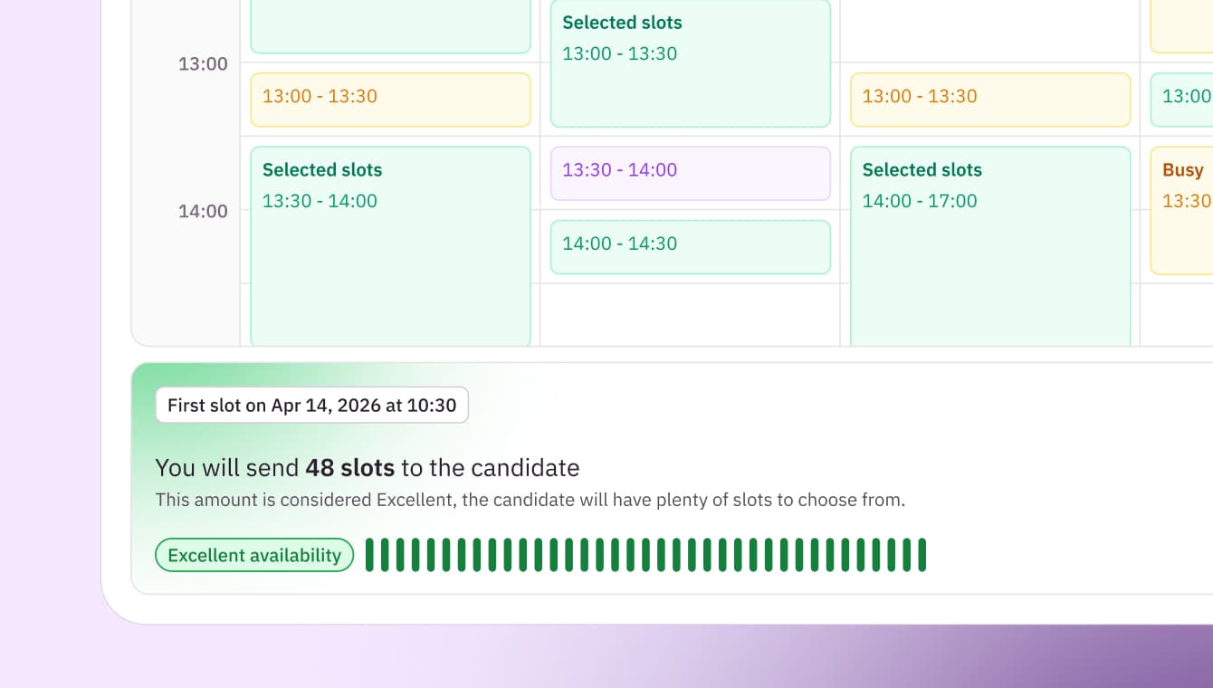
Sits at the bottom of the availability step and updates in real time as the recruiter configures the invite: showing the slot count, the availability level, and what that means for the candidate.
You will send 9 slots to the candidate
This amount is considered Low, the candidate might have issues finding a slot.
Once the logic was validated on its own, it had to survive contact with the real product. A fixed step inside an existing flow, not a standalone component with room to breathe.
The same signal, wherever the recruiter is
The availability levels aren't tied to a fixed slot count, they adapt to what a normal window looks like for that specific role.
A flat number would mislead in both directions. A contextual signal doesn't. What actually feeds that signal is worth its own look, more on that below.
Lets recruiters investigate availability at any point: live, straight from the banner before an invite is even sent, or after, tracking the full slot progression through snapshots mapped to key points in the invite lifecycle.
A recruiter's first question is never “show me what changed.” It's “it was fine when I sent it, what happened?”
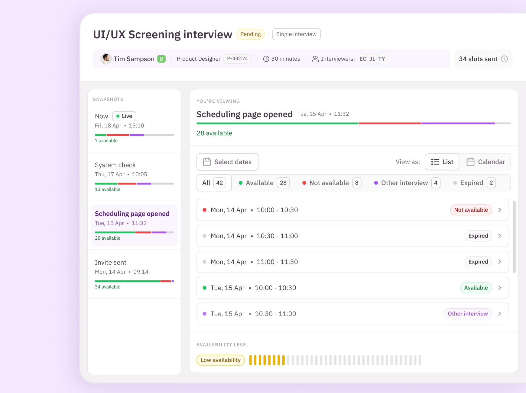
The availability level indicator from the banner sits at the bottom of each snapshot, using the same scale and language. If you understand what Low means before sending, you understand it here too.
From raw count to contextual model
The first version of this idea was a plain slot count. It was simple and simplistic, two numbers from usage data made the case for something smarter.
Of scheduling invites used the SLA-based flow over manually picked specific slots, confirming the signal had to be built around SLA scheduling first, since that's how most recruiters actually work.
Of recruiters using the specific-slots calendar still selected just a single slot, already confirmed with the candidate beforehand. The same signal still had to hold up there, not just in the SLA flow.
What the model weighs
Testing a plain slot count against real scheduling patterns showed the same number meant completely different things depending on role type and seniority, 5 slots is comfortable for a niche senior role and alarming for a high-volume one.
The model that shipped, weighs role type, seniority, scheduling window and historical booking patterns to estimate required capacity, then compares live slot count against that estimate to produce the availability signal.
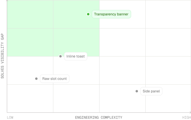
Plotted against effort to build, the banner sat in the sweet spot: far less engineering than a side panel, while closing more of the actual visibility gap than a toast or tooltip ever could.
Prototyping the decision, not just the design
This was a heavily requested feature, before committing engineering time, we needed to validate which direction actually solved the problem.
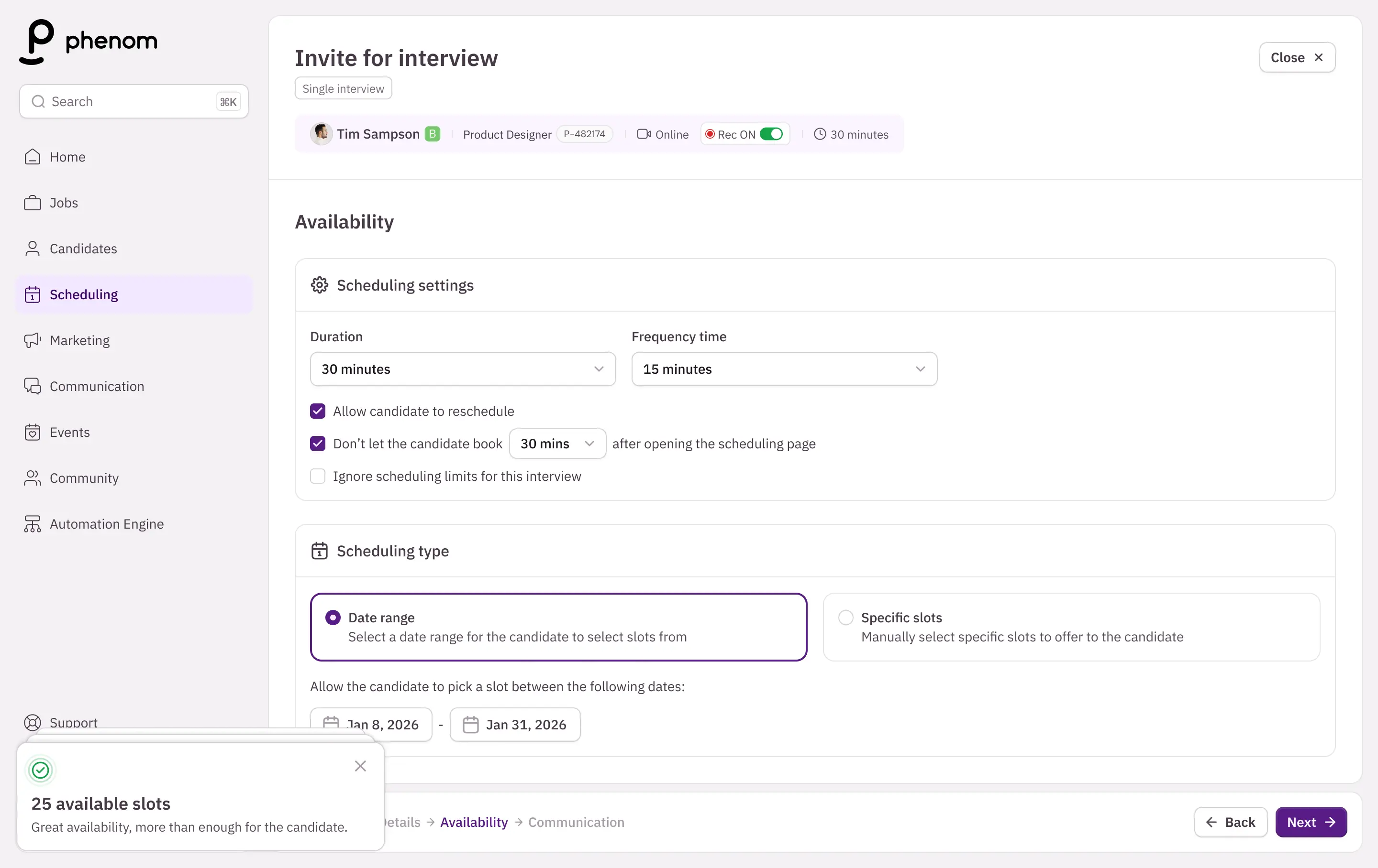
Toast
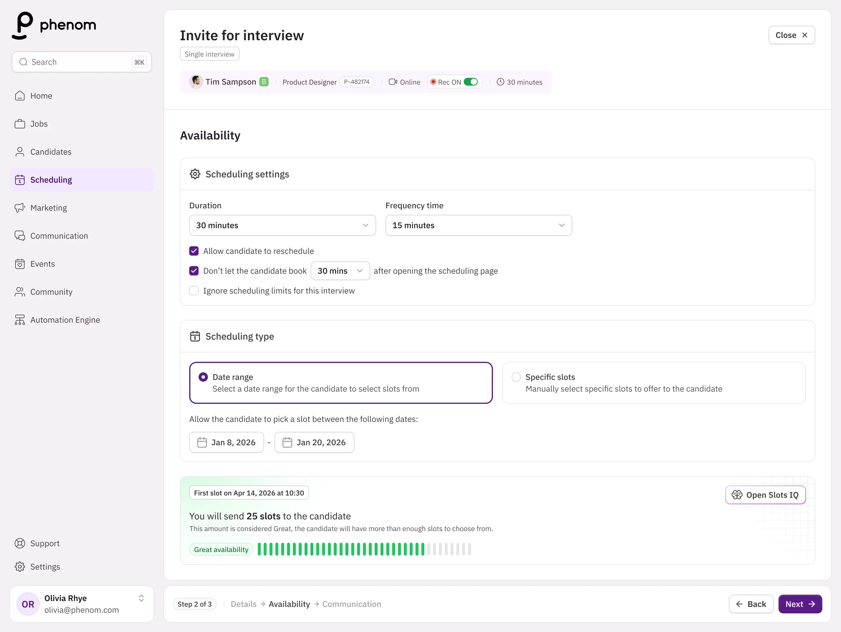
Banner
Both directions went into usability testing as working prototypes. The behavior was clear: the banner outperformed the toast, because recruiters needed the availability signal to stay visible while they configured the ideal interview scenario.
That data and not a personal preference is what decided the direction we shipped.
The debug tool didn't go through the same formal A/B process. It was validated more informally, shadowing recruiters as they worked live escalations and adjusting the snapshot filtering logic based on what they actually clicked into versus what they ignored. Less rigorous than the banner's test and worth naming rather than implying both features got identical treatment.
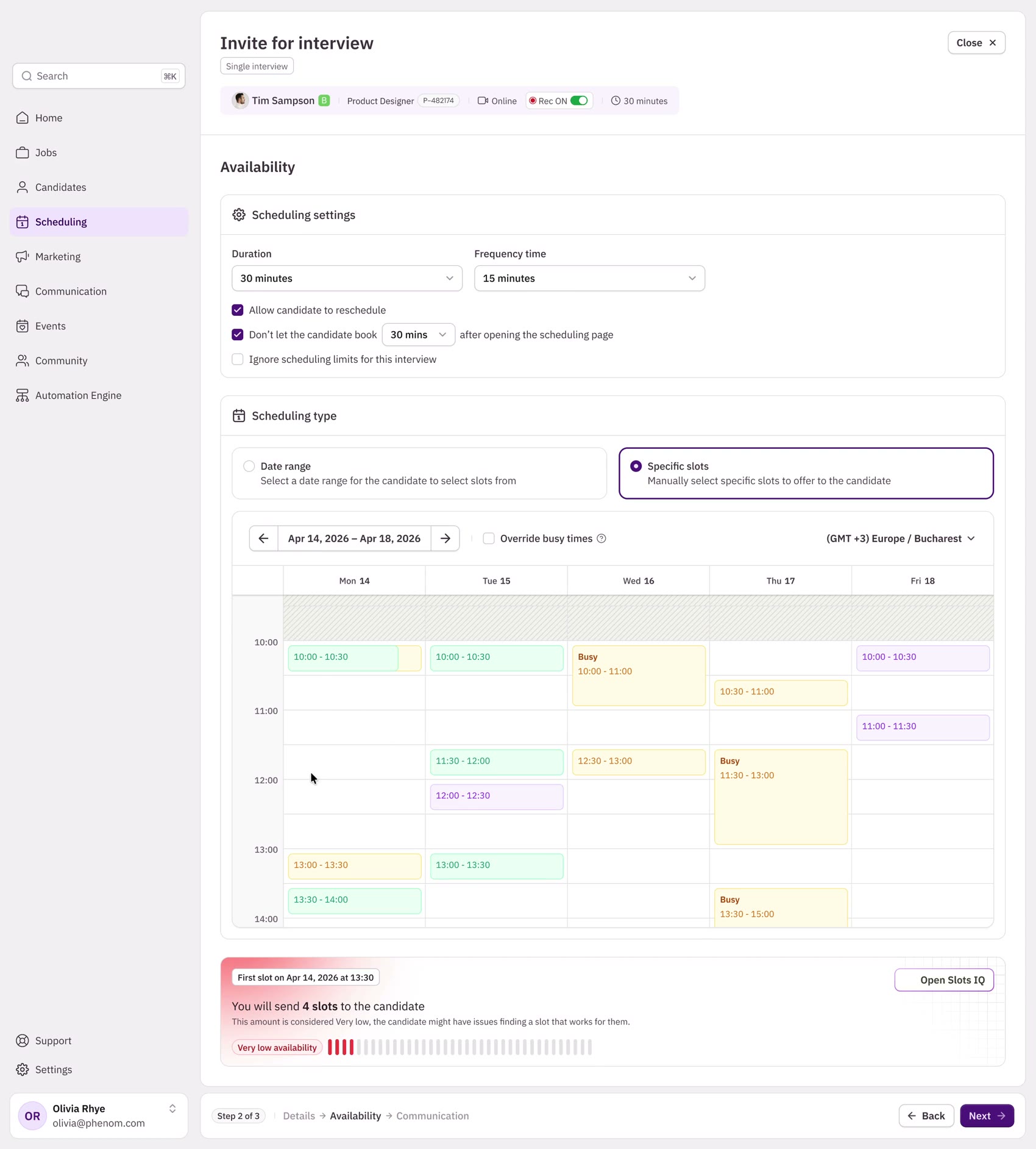

Problem
This was a heavily requested feature, so before committing engineering time, we needed to validate which direction between toast notification and banner, solved the problem.
AI tools used
I used Cursor with Claude Code to quickly build out both versions as testable prototypes, rather than spending days on high-fidelity mocks for a decision we weren't sure of yet.
Judgement calls
The banner outperformed the toast, since recruiters needed the availability signal to stay visible while they try to configure the ideal interview scenario.
Trade-offs made along the way
Interviews are shown back-to-back in a constrained container. A side panel would have competed for the same space the recruiter needed to actually configure the invite. The banner won because it stays out of the way while still staying visible exactly when it matters.
Snapshot navigation needed to support scanning across many points in an invite's lifecycle without losing place. A persistent sidebar made the full timeline scannable at a glance, instead of hiding it behind a single dropdown state.
Not every slot change is worth surfacing. Filtering logic was tuned to snapshot only meaningful shifts, like calendar conflicts, limit changes rather than noise, keeping the timeline readable.
The original scope for the debug tool was recovery-only, to open it after something went wrong. Research surfaced a gap: a recruiter looking at a “Low” banner had no way to see why without first sending the invite, so I pushed to my PM extend the debug view into a live mode, with the same detail panel but no snapshot required, so recruiters could investigate before committing to send, not just after.
What didn't make it through and what still doesn't hold up perfectly
Working within scope
We worked within an established product and design system serving global enterprises, new patterns had to justify themselves against what already existed. Not everything made it through internal review; some directions were reshaped or cut before reaching engineering.
Slots insights
Slot Insights was my first proposal for the debug tool, a feature surfacing a quick summary of interviewer availability, like who was blocking the most slots. After further discussion, we agreed the recruiter needed deeper audit capability: exactly which slots were available and why, live or after send. That shaped Slots IQ.
Known limitations
The availability signal is only as accurate as the calendar and limit data behind it, a stale sync can produce a confident but wrong signal. Debug tool surfaces the reason when that happens, but doesn't fix it automatically, recruiters still act on what they see.
Flow and recovery are different problems
Designing for flow and designing for recovery are fundamentally different problems, even when they're solving the same underlying issue. The banner needed to be instant and unobtrusive, while the debug tool needed to be complete enough that a recruiter never has to open it twice for the same problem.
A raw slot count is simple. A signal adapted to the actual hiring context is harder to build and far more useful to the person making the decision.